Brand Refresh
A New Look for the Same Personal IT
Weve refreshed the ASP identity — a sharper logo, a calmer navy-and-blue palette and a clearer promise. What hasn't changed is everything that matters: the people, the partners and the personal service.
Why a new look?
ASP started as a personal IT service for local businesses. Today we manage full technology stacks — security, cloud, networking, voice, hardware and custom apps — for SMBs across Australia. The old red identity served us well, but as weve grown our clients have come to us for depth and trust, not just speed. The new brand reflects that: confident, considered and clearly professional, while staying warm and human — just like working with Shane.
Before & After
The old vs the new
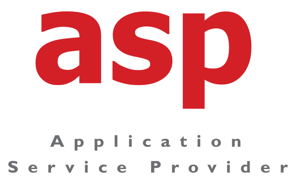
A red, high-energy identity built around urgency and local support.

A navy and bright-blue identity built around trust, depth and clarity.
Old tagline
Australian IT Cloud Experts
New tagline
Personal IT.|Real People.|Practical Outcomes.
What has changed
- A sharper, more confident logo and lockup
- A navy and bright-blue palette replacing the red
- A clearer tagline — Personal IT. | Real People. | Practical Outcomes.
- Refreshed website, email signatures and documents
What hasn't changed
- The same owner-led, personal approach — Shane Grocke
- The same partners: Microsoft 365, Acronis, 3CX, UniFi, Lenovo
- The same 1-hour critical response promise
- The same long-term client relationships
“We changed the colours, not the character. You still get me — the owner — every time, and the same promise: personal IT, real people, practical outcomes.”
Shane Grocke — Director & Owner, ASP
Good Questions
What this means for you
Same people. New look. Let's talk.
If you have any questions about the refresh — or just want to say hello — reach Shane directly.
Get in Touch